Sunday, May 29, 2016

The Bryars' New Sanctuary

This blog post will not be covering a remodel for my own home but that of an amazing couple that I had the opportunity of helping with design and projects. I reached out on Facebook to friends and family seeing if anyone would be brave enough and willing to let me help them remodel a room in their home. Beth quickly responded saying that she needed help giving her and her husband Anthony a grown up bedroom. Many times parents always push things for themselves to the back burner while taking care of things for the kids. That is just what we do. Moms and Dads deserve to have a quiet relaxing spot all to themselves... a sanctuary. I had Beth send me her pin board on Pinterest, pictures of her room and a drawing of the rough layout of the room. I was able to quickly draw inspiration from her pin board and come up with a strong design. Her pins had a reoccurring color scheme so I pulled the color choices from that. The color palette was cool so to warm it up we used wood tones and gold. We were able to refinish furniture they already had to make them fit into the space and save a ton of money by not having to buy new furniture. The only piece they had to buy was the chair and they were able to get it used for a great buy. This was definitely a group effort. I would do some of the decor projects at my home while they did some of them at their home. Anthony is a great painter and a perfectionist so he did a great job with helping bring everything together.  I have always just decorated my own home to my own taste so this was a lot of fun collaborating with some one else. We sent emails and texts with ideas, projects, scores from shopping trips. I was always excited to get a text from Beth seeing what she found. This roughly took a month to put together. We all had to work around work schedules and life. Enough chatting lets get on with the pictures! 

The BEFORE


The INSPIRATION


 The SANCTUARY


 We made a simple inexpensive bookshelf out of crates. The empty corner space was perfect for them and we designated this space as a reading nook. 
They had this little dresser in their garage and wanted more storage in their room. It was a simple cream color with yellow details. We glammed it up with white and gold paint. I love French Provencial styled furniture and was excited to do this piece. 
I saw the wall art on Beth's inspiration board and knew that I could easily make it. I loved mixing the colors of the room and leaving the wood exposed to bring that warm natural element to the room. 


 I LOVE LOVE LOVE how the head board turned out. I thought the warm wood on the navy wall would look amazing. I also wanted to celebrate the couple by having portraits of them in the room. Adding the photos with frames of the same wood makes the headboard look tall and impressive. We explained the idea of the headboard to Anthony and he had the idea of adding the lanterns to the bed and I loved the idea. I stained the wood for the headboard and did the pictures but all of the assembly was all Anthony. 

 We originally were going to go with hanging end tables but between trying to figure out the best way to hang them and realizing with children it might be a bad idea we decided to paint tables they already had gold. They picked out a beautiful gold in Valspar. Beth did a great job styling the table. I gave her the home made stain recipe that I used for the crates and headboard and stained a wood round and made a beautiful tray. I love what she did with the gold letters and candle holders. It was so cute. I used a cheap $1 vase from the Dollar Tree and spruced it up with spray paint and twine. Decorating does not have to be expensive if you don't mind putting in a little time and get creative. 


This 5 panel wall art was soooo affordable. The canvases came in a pack of 5 and we got them on sale for $11.99 at Michaels. I painted them using ideas from her pin board and I wanted to add something a little more personal to the couple so I asked Beth if they had a favorite quote or saying. She said that this is something that they say to each other all of the time. 


 I love taking old dressers and giving them new life. We removed the mirror from their existing dresser and used just the dresser part. We mixed up chalk paint using the left over navy paint. Beth and I painted it and trying hand painting the gold details. We had a hard time so Anthony took care of that part for us using tape and spray paint! We wanted to add updated hardware to it but as we all know that can really add up. I found some cool inspiration where people have used rope or old belts and sent them to Beth. They found beautiful burlap ribbon and I think it turned out great. It added another warm textured element to the design. 

I hope you enjoyed seeing this remodel as much as we enjoyed doing it. I think I might continue working with others to give them spaces that they love. We should all have homes that represent who we are and is a sanctuary from the busy hectic world. 


Saturday, February 27, 2016

From rough to glam! Yard Sale find transformation!

These beautiful dressers and corner table have been sitting in my shed for MONTHS. Andrew and I got them at a yard sale for a total of $25 for all three. As you can see they need some TLC. Normally I go white and distressed... or teal. I really love teal but I had seem some mercury glass dressers and decided to go silver. Mercury glass would have been preferred but I decided to keep this project simple. I bought some Rustoleum silver paint and Rustoleum chrome spray paint (the paint was cheaper in store when I bought them than they are online right now). I also grabbed a stencil from Hobby Lobby. I wanted to stencil a pattern of silver on top of a different silver so that the pattern would be subtle. Now my stenciling skills kind of suck so this is FAR from perfect but it still gives the dressers and table a distressed look while remaining a little glam. On the table I replaced the little knobs with ones that a friend of mine bought me while in Germany. She knows I like fun knobs and I have just held onto them until I found the right project for them. I thought I was going to replace the hardware on the dresser but once I painted the dresser I decided I liked the original and just cleaned it up. When we got them they had the dressers positioned on either side of the table like a desk. I have decided to use the pieces separately. 


Wednesday, December 30, 2015

Aideen's New Bedroom!


I searched through my pictures that I first took of the house before we moved in looking for a before of Aideen's Room... I apparently did not take one :( It was the same color as the kitchen was which made the room look dark and smaller. The picture below is one of my dining room but it shows the color that was originally on the walls of my daughter's room. 


 I transformed every piece of furniture in her room slowly over the last couple of years and finally found the time to finish it all up. I can not wait to get the new floor down. It will look awesome in there. The vanity, the mirror above the dresser and armoire was given to me at different points in my life. I bought the dresser from the Restore for $40, the chair I got from the Bargain Center for $15, and the bed my friend found for us at a yard sale several years ago for $35 I think. Some fresh coats of paint, new fabric, some details on the wall (using 1x4s) and she has a pretty cool space.


We gave the wall a bit of detail by adding 1x4s and painting them the same as the bottom half of the wall. It cost a whole $24 in wood. The letters we picked up from Hobby Lobby for $1.99 a piece and those butterflies I bought at a yard sale for less than $20. I cant remember how much exactly I just know I wouldn't pay more than $20 for them. They are made of metal and were originally blue and black. I broke out some pink spray paint and added some glitter details. 


Here is a link to the post of the chair before and after:


Here is a picture of the before and after of the armoire:


I unfortunately did not take a picture of this piece. I was so excited when I got it I went straight to work completely forgetting the picture. It was originally the classic white with gold details. I added some new knobs on the top to give it a little extra character. 


I actually did a blog on the vanity... a looooonnnng time ago. Like over 2 years ago. Here is the link to see the before and afters of it:


Monday, December 28, 2015

Bedroom Remodel Phase 1

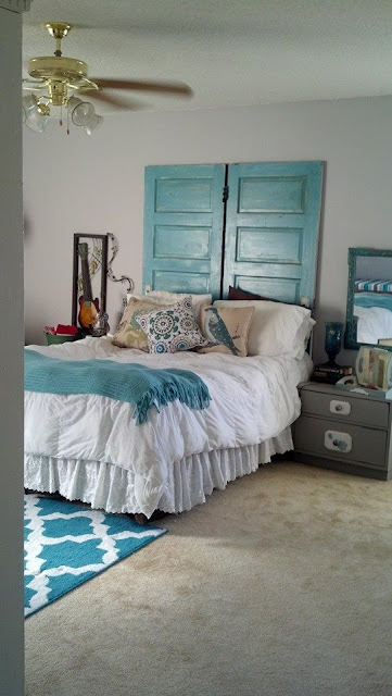
 I started my bedroom redo awhile back and sort of finished awhile back but never posted it. It has since changed a little as I have new bedding. I have a couple of more things to do to it and then I will post much better pictures. These were taken with my phone and aren't the best. Every piece of furniture was painted by me. The night stands were given to me. the dresser was one that Andrew has had pretty much forever from when he still lived at home as a kid. The tall white cabinets were armoires that I bought at a yard sale for $40 a piece. The big panels of art I made using these old foam boards from work. The doors cost me $10 each and made an excellent headboard. The rug I got for $25 at Old Time Pottery. I picked the pillows up for less than $10 a piece from Ross and Kirklands. Nothing in this room was expensive.


Before:

After:


I forgot to take a before pictures of this dresser. It was all wood and from the 80s, maybe early 90s. It was dated with dated hardware. I painted it with chalk paint that I mixed myself and put new hardware on it. 

Monday, November 16, 2015

Our Dining Room Remodel

One more project down! 
Its been a long time since I have posted. I have been doing small projects here and there but the largest project has been laying new floors throughout the house. I hate having a bunch of different flooring in a house, I prefer to have one seamless look. We decided on a laminate from Lumber Liquidators. We bought it on President's Day weekend for $1.79 a square foot! We got enough to do the entire house except for the bathrooms. We will be using a porcelain tile with the wood look to try to get it to match as much as possible. I thought my first post would be of the office aka my photography studio but I have not finished it yet. I wasn't really planning on doing anything to the dining room but once we laid the floor I was definitely ready to get rid of the green, the same green that came with the house. Yes it has taken me two years to get it painted. The first picture is of the dining room  before we moved in. I didn't really do anything to it but move my furniture in and put some stuff on the walls. Those pictures are not that exciting so I thought Id share the blank slate. 


As you can see the room is brighter, warmer and has a lot more personality. 
I had paint left over from painting the living room so I did not have to run out and buy any paint. Actually the only thing I had to buy was the curtains and curtain rods. I got the curtains at TJ MAXX for $16.99 for 2 panels. The wooden headers were actually shelves that I had over my kitchen sink for plants that I removed because the cats kept getting on them and knocking over my plants. So I repurposed them. 
 The corner cabinet was given to me and up until now lived in my foyer. As I was redoing everything I knew that the dining room would make a much better home for it. 
 The lighting fixture was purchased at a local pallet liquidation place. I got it for a whopping $38! 

I love how it turned out. I love the combination of the neutral colors with the wood grains. Right now this is my favorite room in the house and I think I just want to sit in here awhile. 

Saturday, March 21, 2015

The Egg Haus


One of the first things we decided we wanted when we bought this house with all of this land was that we wanted chickens. So here we are a year and a half later and finally built our coop. I did not take pictures of the progress and honestly this was not one of my cheap projects. We are NOT builders so I went off of the simple design of the coop that my Mom and Dad built when I was a kid. We decided to keep things even more simple and do an 8x8 pen design and a 4x8 hen house design. There was minimal cutting. We did use posts sunk into the ground because living in the middle of fields we get some crazy wind out here and we didn't want it going anywhere, Now we just need the chickens!

Thursday, September 18, 2014

My View from here!

Andrew and I sit on the front porch or in the kitchen often admiring our sunsets. They are so beautiful. They don't get old and are never the same. Sometimes they are screaming at me to grab my camera and make them a permanent memory as they are constantly changing. 
 As beautiful as the sunsets are the lightning storms as just as impressive. Andrew called me out one night to check it out. I had never tried photographing the lightning and this image is far from perfect... the camera was resting on the ground being propped by its own strap and I had to ever so carefully push the button. Even though its not perfect.. its cool!